


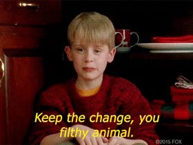
⚪️ F*** you packaging design from the 90s
This week is about bringing the archive alive as I go back to the 90s to look at packaging that stuck two fingers up at the rules of selling food.
👋 I’m Lauren from Thought Sauce - a Substack made for creators of all kinds. I’m a creative strategist with 15+ years of cross-industry experience. I help companies cut through complexity. All about crafting strategy with soul and building stuff that moves people. Focused on the unique elements of creative work: imagination, empathy, and the power of well-told stories.📝Thought Sauce is a journal about creativity and connection.

Image credit: Adobe Express and Lauren Alexandra

Relight my fire by Take That is heating up the UK charts, the first internet search engine ‘Alta Vista’ has launched, Street Fighter II is the game, and I’m dressed like an extra from Clueless. That’s right, it’s 1993. And the rules are being ridden out of town on Meatloaf’s motorbike.
Summer 1993. I’m heading to the shopping centre with my Nan. The one that has the good shoe shop in it. At this time, good means shoes with high heels and platforms. As I longingly walked past “Medina Shoes”, I realise no such platform purchases were being offered, so now I just want to get back to steal a go on my auntie’s Game Boy before she gets home. Tetris obviously. Before any such joy though, we’re heading into Kwik Save to ‘get some bits.’
Food packaging has all these rules. Apart from functionally keeping stuff fresh, there’s a whole load of visual rules out there. The colours should be red and yellows; they need to entice us to eat them by convincing us that they - not the 10 other varieties of the same thing sitting next to them…no, they are the one to choose. Decades of research have looked at how to do this well. Alongside visual rules there were a lot of social cues about financial status related to what brands were in your cupboards. We’ve seen cultural impacts highlighted by TV shows demonstrating how people believe certain brands taste better… Heinz, not Tesco’s own brand beans - but then many fail the taste tests of their beloved beans in front of the cameras.
Own brand
In today’s world, being your own brand is a positive thing. A supermarket’s own brand in food shopping in 1993 meant something else. A sort of social cue that meant you were either hard up or a bit cheap. The lack of branded packaging in their cupboards was not what people wanted. There’s still a bit of this vibe about today, but a lot has been done with packaging to blur the lines between supermarkets’ own branded food and the food brands of the world. Here’s a look at what you might see today, side by side.
Image credit: Tesco.com
No Frills
In 1993, and to this day, the branding of Kwik Save’s own brand of food flew in the face of social, cultural and food packaging rules.
As a kid, I wasn’t part of these social and cultural cues, so I thought it was ace. A cupboard filled with this looked like a storage-based navy seal, shouting BEANS at you when you opened the cupboard door. I’m here, and I’ve got no goddamn frills. Deal with it.
It gives military vibes… utilitarian, necessity. What I now appreciate as a f*** you black and white aesthetic is nowhere to be found across today’s supermarket. With companies in the US and Canada using the No Frills name from 1978 onwards, and although there’s a view that Australian supermarket “Franklin’s” started the range, it’s hard to trace who put Kwik Save’s No Frills aesthetic to the UK with any certainty. Still, I give thanks for the design's simplicity. Namaste 🙏.
Image credit: Chez Laro Books, Pinterest.
Where did it all start?
It seems that own-brand produce starts in Tesco’s story. As its original creator, Jack Cohen negotiated the supply from a tea company that he would brand as Tesco’s first own-label product back in 1924. Cohen recognised the desire for a budget range of products.
👉 Side note on last week’s article about using reflecting in design, something Jack Cohen did in World War II is a great example of this in action. When the war began, Cohen created, unique to Tesco, a points-based system. So regardless of your financial status, everyone stood equal when you went to Tesco.
Image credit: thegrocer.co.uk. See links below for more.
Back to the 90s, a price war was underway between all the big supermarkets.
At this point Kwik Save is the 3rd largest UK supermarket. And it talks like this:
“No fuss, no frills, we simply save you money at the tills.”
Boom.
Circa ‘93 / ’94, though, it was all about the beans. Aldi, Netto, Tesco, and Kwik Save were in their own price war. At one point, like the navy seal that it was, beans at Kwik Save were reduced to 5p for a 425g tin as a retort to reductions by the other stores. BEANS 🫡.
While No Frills black-and-white vibes filled Kwik Save’s aisles, the impact was felt in designs across its own brands, as Tesco responded with its blue and red value range, designed by Rocket.
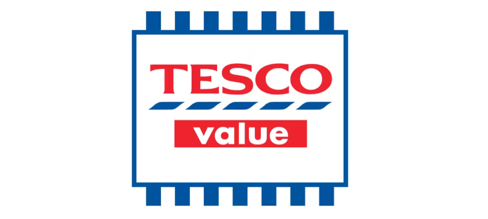
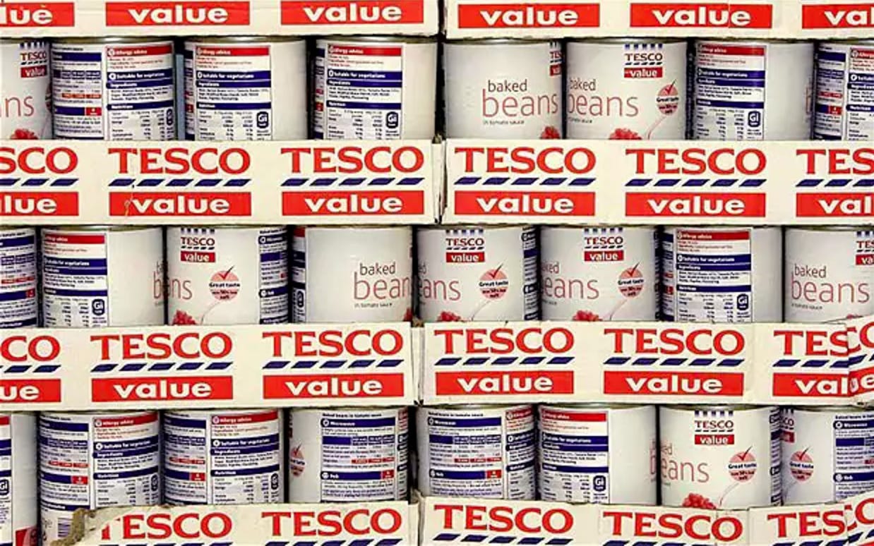
Image credits: marketingweek.com
An interesting knock-on effect of no-frills design continues as Ikea gains popularity and launches its Chuck Out Your Chintz campaign. We were clearly appreciating visually simpler times.
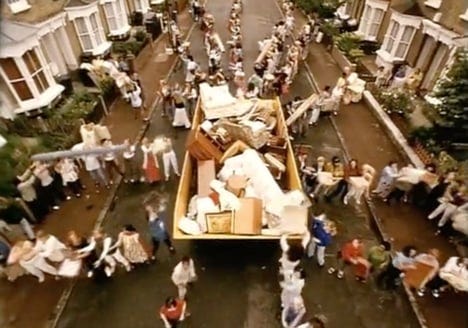
Image credit: Dezeen.com
I love this packaging. I’d love my cupboard to look like this… I say bring back no frills. Life is complicated enough.
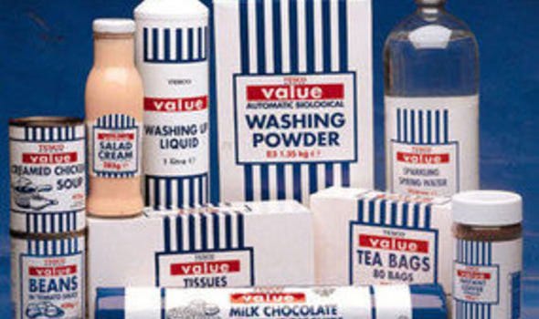
Image credit: daily express.co.uk
P.S. I did promise an occasional actual sauce-based chat. Given that this week has been very baked bean-focused, I have to share a sauce revelation. Let’s just say a little bit of Naga chilli sauce was added to some baked beans on a jacket potato (with garlic butter and cheese, of course), and it was spectacular. There was also a pizza sauce incident I won’t go into, but we’ll leave it at “heavy-handed.”
Go forth and Naga. Thanks for bringing the archive alive with me this week.

Links
For more on Tesco and Jack Cohen: The Grocer does a great job of the full Tesco story here.